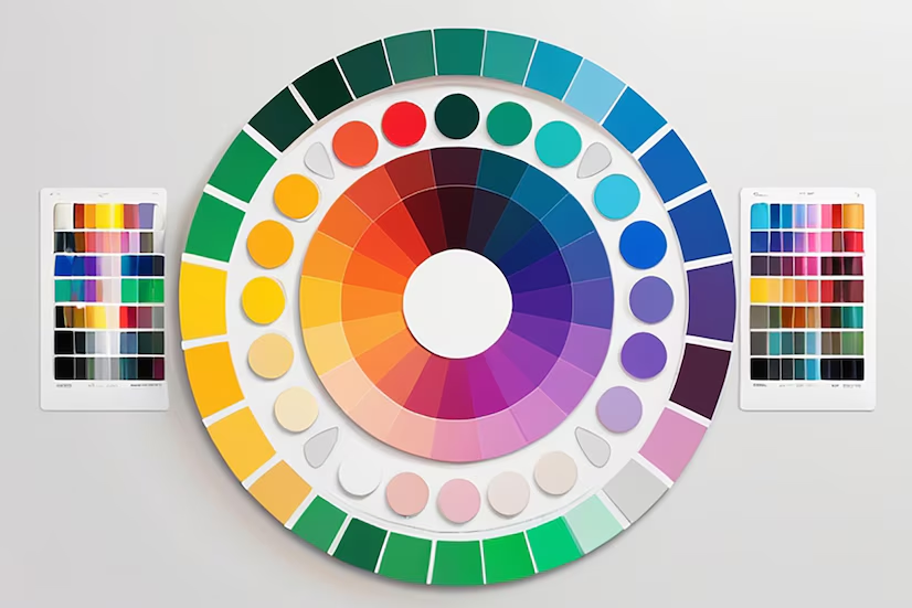
The Role of Color Psychology in Packaging Design
In the world of packaging design, color does more than make products visually appealing—it’s a powerful tool that influences consumer emotions, perceptions, and purchasing decisions. Understanding the role of color psychology can elevate your brand, attract the right customers, and even foster brand loyalty. Here’s how each color plays a part in your packaging strategy and why these choices matter.
1.The Psychology Behind Colors in Packaging Design
Every color evokes certain emotions and associations, which packaging designers strategically leverage to attract target audiences. For example:
- Red: Bold, energetic, and attention-grabbing. Often used to stimulate appetite (think of food brands) and create a sense of urgency.
- Blue: Associated with trust, calmness, and professionalism. Commonly used in technology and healthcare products.
- Green: Signifies health, eco-friendliness, and relaxation, making it a popular choice for wellness and organic products.
- Black and White: These neutral tones evoke sophistication and luxury. Black signifies elegance, while white suggests simplicity and purity.
- Yellow: Joyful, positive, and youthful, often used to grab attention on shelves and evoke happiness.
2.How Color Impacts Brand Perception
Color plays a major role in how customers perceive your brand at a glance. By carefully selecting your packaging colors to align with your brand’s values, you can communicate your message before a word is even read. Consistent color choices across all your product lines also foster brand recognition, which builds customer trust and familiarity.
3.Creating Emotional Connections through Color
When customers feel an emotional connection to a product, they’re more likely to purchase it. A beautifully designed package that taps into a consumer’s feelings—whether it’s excitement, nostalgia, or trust—can drive higher engagement and brand loyalty. For example, pastels in baby products create a sense of calm and safety, while vibrant colors on snack packaging convey excitement and fun.
4.Choosing Colors Based on Target Audience
Different age groups, cultures, and genders respond uniquely to various colors. Researching and understanding your target audience’s preferences is key. Millennials, for example, may be drawn to minimalist and pastel designs, while Gen Z leans toward bold and expressive colors. Recognizing these preferences allows brands to design packaging that resonates deeply with specific demographics.
5.Testing Color Effectiveness in Packaging
A/B testing can be a great way to determine which color combinations work best for your packaging. By experimenting with variations, you can gather insights into which designs attract the most customer attention and conversions.
Make an Impact with Color in Your Packaging Design
Color is not just an aesthetic choice—it’s a strategic one. By aligning your packaging colors with your brand values and audience expectations, you can create a memorable product experience that keeps customers coming back.
Ready to Elevate Your Brand with Thoughtful Packaging Design?
At CreativeKatta, we specialize in crafting designs that make an impact. Let our team help you bring your brand to life with packaging that not only stands out but also resonates with your audience.
Contact CreativeKatta Today to Start Your Project!


