
Color does far more than make products look attractive. So, in packaging design, it acts as a genuinely powerful tool, shaping emotions, perceptions, and purchase decisions.
Because of this, understanding color psychology can elevate your brand significantly. Below, here’s exactly how each color plays a role in your packaging strategy, and why these choices matter so much.
1. The Psychology Behind Colors in Packaging Design
First, every color evokes specific emotions and associations. So, designers strategically use these to attract the right audience.
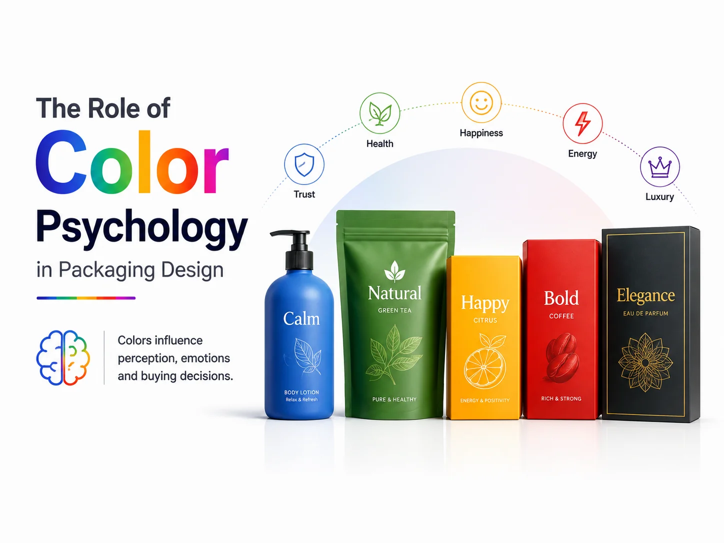
For instance, red feels bold and energetic, often stimulating appetite and urgency, which is why food brands use it often. Meanwhile, blue signals trust and calm, making it common in technology and healthcare.
Additionally, green suggests health and eco-friendliness, fitting wellness and organic products naturally. So, black and white communicate sophistication, with black signaling elegance and white suggesting purity. Finally, yellow feels joyful and youthful, grabbing attention on crowded shelves.
2. How Color Impacts Brand Perception
Next, color shapes how customers perceive your brand instantly. So, by aligning packaging colors with your brand’s values, you communicate your message before anyone reads a word.
Therefore, consistent color choices across product lines also build genuine recognition. This way, trust and familiarity grow naturally with every purchase.
3. Creating Emotional Connections Through Color
Meanwhile, emotional connection drives real purchasing behavior. So, when a package taps into feelings like excitement, nostalgia, or trust, engagement and loyalty follow naturally.
For instance, pastel tones on baby products create calm and safety. On the other hand, vibrant colors on snack packaging convey fun and excitement instead.
4. Choosing Colors Based on Target Audience
However, different demographics respond to color differently. So, age, culture, and gender all shape color preference in unique ways.
Therefore, understanding your audience matters enormously. Millennials, for instance, often gravitate toward minimalist, pastel designs, while Gen Z tends to favor bold, expressive colors instead.
5. Testing Color Effectiveness in Packaging
Finally, don’t rely on assumptions alone. Instead, A/B testing reveals which color combinations genuinely resonate with your audience.
So, by experimenting with variations, you gather real insight into which designs attract attention, and which ones actually drive conversions.
Bringing It All Together
Ultimately, color isn’t just an aesthetic choice; instead, it’s a strategic one. So, by aligning your packaging colors with your brand values and audience expectations, you create a memorable experience that keeps customers coming back.
Ready to Elevate Your Brand With Thoughtful Packaging Design?
At CreativeKatta, we specialize in crafting packaging designs that make a real impact. Let our team help bring your brand to life with packaging that stands out and genuinely resonates.
Contact CreativeKatta today to start your project.
Frequently Asked Questions
Q: Why does color matter so much in packaging design? A: Because color influences emotion and perception instantly. So, the right palette communicates your brand’s message before a customer reads a single word.
Q: How do I choose the right colors for my target audience? A: Research demographic preferences first. Since age, culture, and generation all shape color response differently, understanding your audience helps you design packaging that truly resonates.
Q: Is A/B testing really necessary for packaging colors? A: It helps significantly. Because assumptions can be wrong, testing real variations reveals which colors actually drive attention and conversions for your specific audience.