
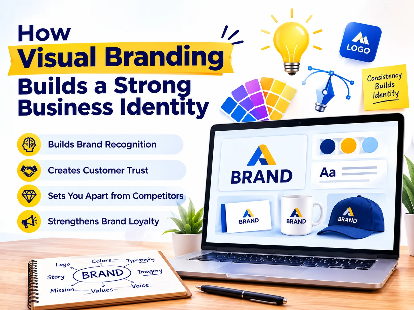
First, visual branding is the strategic use of visual elements, logos, colors, typography, imagery, and design patterns, to communicate who a business is, what it stands for, and why customers should choose it over competitors. So, simply put, it’s genuinely the face of your brand.
More importantly, visual branding does something no tagline or pitch deck can do alone: it communicates instantly, emotionally, and without language. So, a warm amber palette signals warmth and craft. Clean white space signals precision and professionalism. A hand-drawn logo signals authenticity and personality. Therefore, these signals get absorbed in milliseconds, long before the rational mind kicks in.
As Intuit co-founder Scott Cook put it: a brand is no longer what we tell the consumer it is; instead, it’s what consumers tell each other it is.
Therefore, investing in visual branding isn’t about aesthetics for its own sake. Instead, it’s genuinely about engineering the right perception in the right audience, consistently, across every touchpoint.
The Core Elements of Visual Branding
Next, it helps to understand what visual branding is actually made of. So, each element plays a distinct role, and together, they create a system far greater than the sum of its parts.
Your logo anchors your visual identity. So, a great logo stays memorable, scalable, and meaningful, working just as well on a business card as it does on a billboard. Meanwhile, your color palette drives emotion and recall. Therefore, a deliberate palette of two to four colors creates instant recognition, and sets the emotional tone of your brand.
Additionally, your typography communicates personality before anyone reads a word. So, serif fonts feel authoritative, sans-serif fonts feel modern, and script fonts feel personal. Meanwhile, imagery and photography signal taste, audience, and brand values in ways text simply can’t replicate.
Now, your layout and grid system matters too. So, a consistent spatial rhythm across your website, packaging, and materials creates a genuine sense of order and professional quality. Finally, icons and graphic elements extend your visual language into every corner of your communications.
Color Psychology: The Science Behind Brand Perception
However, of all visual branding elements, color is arguably the most powerful, and the most misunderstood. So, specifically, different colors trigger measurable emotional and psychological responses in viewers, which is why color choice in branding is never genuinely arbitrary.For instance, blue communicates trust, reliability, and calm, which is why it dominates banking, healthcare, and technology brands. Red signals urgency, energy, and appetite, making it a favorite in food and retail. Green evokes nature, health, and growth. Black suggests luxury, precision, and authority.
However, color psychology isn’t a simple formula. So, cultural context, industry norms, and your specific audience all influence how color genuinely lands. Therefore, a skilled branding partner doesn’t just pick colors that “look good”; instead, they select colors that align with your positioning, and resonate with your target market.
So, here are five practical color branding principles. Limit your core palette to two or three primary colors, with one or two accents, since fewer colors create stronger recall. Define exact HEX, RGB, and CMYK values for every brand color, and use them consistently across all channels.
Additionally, test your palette in both light and dark contexts, on white backgrounds, dark packaging, and on screen. Ensure sufficient contrast ratios, so your brand stays readable for all users, including those with visual impairments. Finally, choose a color your direct competitors aren’t using, since differentiation matters just as much as psychology.
Your Logo Is Not Just a Symbol, It's a Strategy
Meanwhile, contrary to popular belief, a great logo isn’t great because it’s beautiful. Instead, it’s great because it works, across contexts, at every size, in black and white, and in the minds of your customers long after they’ve closed your website.
Consider the logos that have stood the test of time: the Nike swoosh, the Apple silhouette, the Mercedes star. So, each stays simple, distinctive, and infinitely scalable. None requires text to be recognized. As a result, they’ve become some of the most valuable pieces of intellectual property in the world.
Therefore, when designing your logo, the key questions aren’t “does it look good?” Instead, ask: does it communicate the right values? Is it distinct from competitors? Will it remain relevant in five years? Can it be reproduced clearly at 16 pixels and at 16 meters?
As Steve Jobs famously said: design isn’t just what it looks like and feels like. Design is genuinely how it works.
Why Consistency Is the Most Underrated Branding Decision
Now, here’s a truth many businesses learn the hard way: a brilliant logo and a beautiful color palette mean very little if applied inconsistently. In other words, inconsistency doesn’t just look unprofessional; instead, it actively erodes trust.
Think about it from a customer’s perspective. So, if your Instagram uses warm, earthy tones but your website feels cold and corporate, that’s a mismatch. If your business card uses one font while your emails use three others, and your packaging looks like it belongs to a different company, that’s a mismatch too. Customers sense the disconnection, even if they can’t name it. Consequently, they trust you less.
Therefore, create a brand style guide that documents logo rules, color values, typography, image guidelines, and tone of voice in one reference document. Additionally, audit every touchpoint: list every place your brand appears, website, social, email, print, and ensure visual alignment across all of them. This way, building pre-made, on-brand templates for posts and documents removes guesswork, and protects your identity at scale.
Furthermore, consistency compounds over time. So, every touchpoint where your brand looks and feels the same reinforces recognition. Over time, recognition becomes familiarity, and familiarity becomes trust, genuinely the single most important asset any business can build.
Typography: The Silent Communicator
However, typography remains one of the most overlooked elements of brand identity, and one of the most powerful. In fact, the font you choose communicates personality and values before a single word gets read.
For example, a law firm using a bold geometric sans-serif sends a very different signal than one using a classic elegant serif, even if the words stay identical. Ultimately, typography shapes the emotional experience of reading your brand’s communications.
Therefore, a strong typographic system typically includes a display font for headlines, a body font for long-form reading, and clear rules for sizing, weight, and spacing. As a result, every piece of communication feels genuinely coherent and intentional.
How Visual Branding Directly Drives Business Growth
Now, at this point, you may be wondering: does this actually translate to business outcomes? So, the answer is a clear yes, and the evidence is substantial.
First and foremost, strong visual branding increases perceived value. So, research consistently shows consumers assign higher value to well-branded products, even when the underlying product stays identical to an unbranded alternative. In other words, great branding is genuinely a pricing strategy in disguise.
Beyond that, visual branding reduces customer acquisition costs. So, when your brand stays distinctive and memorable, word-of-mouth increases, ad creative performs better, and customers seek you out, rather than being paid to find you.
Additionally, consistent branding builds employee pride and internal alignment. So, teams that feel proud of their brand sell more effectively, and stay longer. Therefore, your brand isn’t just an external asset; instead, it shapes company culture from the inside out.
How to Get Started With Strategic Visual Branding
Finally, if you’re ready to build or refresh your visual brand, the process doesn’t have to feel overwhelming. So, here’s a clear starting point.
First, define your brand positioning. So, clarity on your audience, values, and unique difference informs every design decision that follows. Next, research your competitive landscape, to understand visual conventions in your industry, then decide which to follow and which to disrupt.
Therefore, develop a cohesive visual identity system. So, logo, color, typography, and imagery should get designed together as a unified system, not as separate projects. Then, document everything in a brand style guide, and share it with every team member, agency, and partner.
Finally, apply your identity consistently, and audit regularly. So, roll out your identity across every touchpoint, then review quarterly to maintain standards. Additionally, partner with specialists who understand strategy, not just design, since great visual branding sits at the intersection of aesthetics, psychology, and business strategy.
Let CreativeKatta Craft a Visual Identity That Works as Hard as You Do
From brand strategy and logo design to complete identity systems and brand guidelines, CreativeKatta helps businesses build brands that are seen, remembered, and trusted.
Start your brand project with CreativeKatta, and let’s craft a visual identity that genuinely works.
Let CreativeKatta Craft a Visual Identity That Works as Hard as You Do
Q: What is visual branding in simple terms? A: Visual branding is the collection of elements, including your logo, color palette, typography, imagery, and design style, that work together to communicate your business’s identity and personality to customers.
Q: What’s the difference between a brand and a visual identity? A: A brand is the overall perception of a business, including its reputation and the emotional experience it creates. So, a visual identity is the set of tools used to express and reinforce that perception.
Q: How long does it take to build a visual brand identity? A: A comprehensive identity, including strategy, logo design, color palette, typography, and guidelines, typically takes four to twelve weeks depending on scope. So, rushing the process often leads to generic or inconsistent results.