
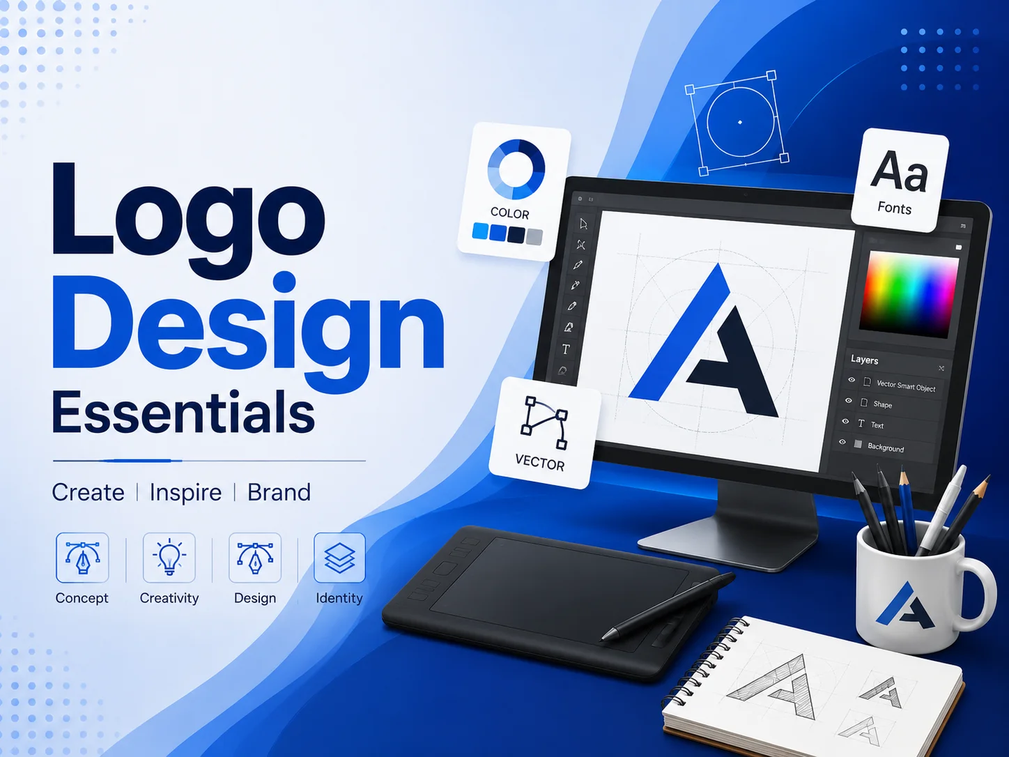
A logo is more than a graphic. Instead, it’s the visual heartbeat of your brand. So, within a split second, it tells people who you are, what you stand for, and whether they should trust you.
But here’s the catch. Most logos fade from memory within seconds. Only a rare few stick for decades. So, what separates a forgettable logo from an iconic one? Below, we break down the six principles behind truly timeless logo design.
1. Simplicity: Why "Less" Almost Always Wins
Think about Apple’s bitten fruit or Nike’s swoosh. Neither design is complex. Yet both are instantly recognizable, anywhere in the world. That’s not an accident.
Rather, it’s proof that simplicity works. A cluttered logo confuses the eye. On the other hand, a clean, minimal design sticks in memory instantly. So, before adding another element to your logo, ask yourself: does this actually help, or does it just add noise?
2. Versatility: One Logo, Every Platform
Next, consider where your logo actually lives. It might appear on a tiny app icon, a business card, or a massive billboard. Because of this, versatility isn’t optional; it’s essential.
Therefore, a well-designed logo scales up and down without losing clarity. Similarly, it should work in full color, single color, or black and white. This way, your brand stays sharp and recognizable, no matter the platform.
3. Relevance: Does Your Logo Actually Tell Your Story?
Now, here’s something many businesses overlook. A logo shouldn’t just look nice. Instead, it should communicate something real about your brand’s values and personality.
For instance, a playful startup might use rounded shapes and bright colors. Meanwhile, a law firm might lean toward sharp lines and deep blues. So, before finalizing a design, dig into your brand’s mission first. Once that’s clear, the visual direction becomes far easier to define.
4. Color Psychology: The Silent Message Behind Every Shade
Colors speak louder than most businesses realize. Specifically, blue often signals trust, while red creates urgency and energy. Meanwhile, green tends to suggest growth or sustainability.
Consequently, choosing the wrong palette can send the wrong message entirely, even if the design itself looks great. So, always select colors based on the emotion you want your audience to feel, not just personal preference.
5. Timelessness: Designing Beyond the Trend Cycle
Trends move fast, but great logos don’t chase them. Instead, they rise above them. Think about it: gradients, 3D effects, and bold trends come and go every few years.
However, if your logo depends on a trend to feel current, it will age quickly. Therefore, focus on strong fundamentals first, like shape, balance, and clarity. This way, your logo still feels fresh a decade from now.
6. Memorability: The Final, Non-Negotiable Test
Ultimately, every principle above leads to one goal: memorability. So, ask yourself this simple question. If someone saw your logo for just three seconds, would they remember it tomorrow?
If the answer is no, something needs to change. Often, a small tweak, like a distinctive shape or clever use of negative space, makes all the difference.
Bringing It All Together
In the end, great logo design isn’t about luck. Instead, it’s a deliberate process built on simplicity, versatility, relevance, smart color choices, timeless fundamentals, and true memorability.
When these elements align, your logo becomes more than an image. Rather, it becomes a lasting symbol of your brand’s identity. That’s exactly what CreativeKatta’s logo design process is built to deliver, every single time.
Frequently Asked Questions
Q: What makes a logo timeless instead of trendy? A: A timeless logo relies on strong fundamentals, like shape and balance, rather than fleeting design trends. As a result, it stays relevant for years, not just months.
Q: How important is color in logo design? A: Extremely important. Because colors trigger specific emotions, the right palette helps your audience instantly feel the right message about your brand.
Q: Should a logo be redesigned often? A: Not usually. Instead, minor refinements over time work better than frequent, drastic redesigns, since consistency builds stronger brand recognition.